TL;DR -> How can one create a legend for a line graph in
Matplotlib'sPyPlotwithout creating any extra variables?
Please consider the graphing script below:
if __name__ == '__main__': PyPlot.plot(total_lengths, sort_times_bubble, 'b-', total_lengths, sort_times_ins, 'r-', total_lengths, sort_times_merge_r, 'g+', total_lengths, sort_times_merge_i, 'p-', ) PyPlot.title("Combined Statistics") PyPlot.xlabel("Length of list (number)") PyPlot.ylabel("Time taken (seconds)") PyPlot.show() As you can see, this is a very basic use of matplotlib's PyPlot. This ideally generates a graph like the one below:
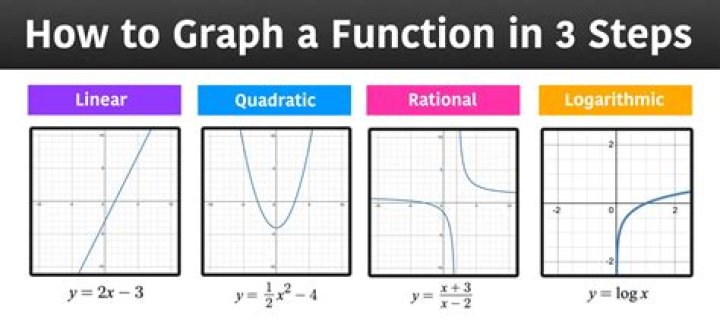
Nothing special, I know. However, it is unclear what data is being plotted where (I'm trying to plot the data of some sorting algorithms, length against time taken, and I'd like to make sure people know which line is which). Thus, I need a legend, however, taking a look at the following example below(from the official site):
ax = subplot(1,1,1) p1, = ax.plot([1,2,3], label="line 1") p2, = ax.plot([3,2,1], label="line 2") p3, = ax.plot([2,3,1], label="line 3") handles, labels = ax.get_legend_handles_labels() # reverse the order ax.legend(handles[::-1], labels[::-1]) # or sort them by labels import operator hl = sorted(zip(handles, labels), key=operator.itemgetter(1)) handles2, labels2 = zip(*hl) ax.legend(handles2, labels2) You will see that I need to create an extra variable ax. How can I add a legend to my graph without having to create this extra variable and retaining the simplicity of my current script?
7 Answers
Add a label= to each of your plot() calls, and then call legend(loc='upper left').
Consider this sample (tested with Python 3.8.0):
import numpy as np import matplotlib.pyplot as plt x = np.linspace(0, 20, 1000) y1 = np.sin(x) y2 = np.cos(x) plt.plot(x, y1, "-b", label="sine") plt.plot(x, y2, "-r", label="cosine") plt.legend(loc="upper left") plt.ylim(-1.5, 2.0) plt.show()  Slightly modified from this tutorial:
You can access the Axes instance (ax) with plt.gca(). In this case, you can use
plt.gca().legend() You can do this either by using the label= keyword in each of your plt.plot() calls or by assigning your labels as a tuple or list within legend, as in this working example:
import numpy as np import matplotlib.pyplot as plt x = np.linspace(-0.75,1,100) y0 = np.exp(2 + 3*x - 7*x**3) y1 = 7-4*np.sin(4*x) plt.plot(x,y0,x,y1) plt.gca().legend(('y0','y1')) plt.show() 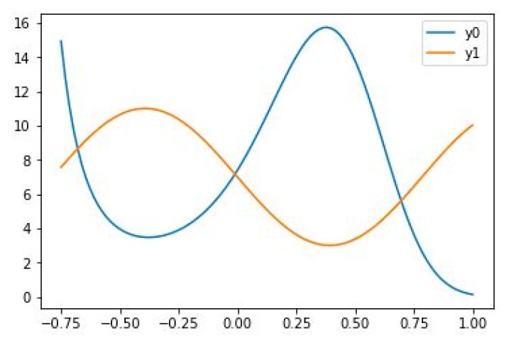
However, if you need to access the Axes instance more that once, I do recommend saving it to the variable ax with
ax = plt.gca() and then calling ax instead of plt.gca().
Here's an example to help you out ...
fig = plt.figure(figsize=(10,5)) ax = fig.add_subplot(111) ax.set_title('ADR vs Rating (CS:GO)') ax.scatter(x=data[:,0],y=data[:,1],label='Data') plt.plot(data[:,0], m*data[:,0] + b,color='red',label='Our Fitting Line') ax.set_xlabel('ADR') ax.set_ylabel('Rating') ax.legend(loc='best') plt.show()
A simple plot for sine and cosine curves with a legend.
Used matplotlib.pyplot
import math import matplotlib.pyplot as plt x=[] for i in range(-314,314): x.append(i/100) ysin=[math.sin(i) for i in x] ycos=[math.cos(i) for i in x] plt.plot(x,ysin,label='sin(x)') #specify label for the corresponding curve plt.plot(x,ycos,label='cos(x)') plt.xticks([-3.14,-1.57,0,1.57,3.14],['-$\pi$','-$\pi$/2',0,'$\pi$/2','$\pi$']) plt.legend() plt.show() 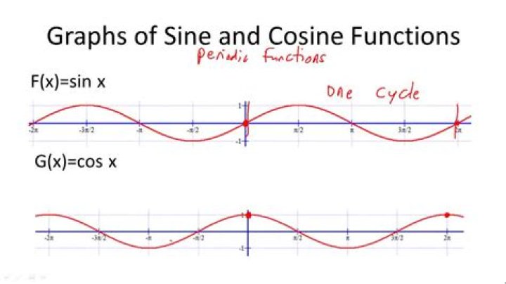
You can add a custom legend documentation
first = [1, 2, 4, 5, 4] second = [3, 4, 2, 2, 3] plt.plot(first, 'g--', second, 'r--') plt.legend(['First List', 'Second List'], loc='upper left') plt.show()
Add labels to each argument in your plot call corresponding to the series it is graphing, i.e. label = "series 1"
Then simply add Pyplot.legend() to the bottom of your script and the legend will display these labels.
# Dependencies import numpy as np import matplotlib.pyplot as plt #Set Axes # Set x axis to numerical value for month x_axis_data = np.arange(1,13,1) x_axis_data # Average weather temp points = [39, 42, 51, 62, 72, 82, 86, 84, 77, 65, 55, 44] # Plot the line plt.plot(x_axis_data, points) plt.show() # Convert to Celsius C = (F-32) * 0.56 points_C = [round((x-32) * 0.56,2) for x in points] points_C # Plot using Celsius plt.plot(x_axis_data, points_C) plt.show() # Plot both on the same chart plt.plot(x_axis_data, points) plt.plot(x_axis_data, points_C) #Line colors plt.plot(x_axis_data, points, "-b", label="F") plt.plot(x_axis_data, points_C, "-r", label="C") #locate legend plt.legend(loc="upper left") plt.show()