The HTML elements del, strike, or s may all be used for a text strike-through effect. Examples:
<del>del</del> ....gives: del
<strike>strike</strike> and <s>strike</s> ....gives: strike and strike
The CSS text-decoration property with a value line-through may be used similarly. The code...
<span style='text-decoration:line-through'> text-decoration:line-through </span> ...will also render to look like: text-decoration:line-through
However, the strikethrough line is typically the same color as the text.
Can CSS be used to make the line a different color?
115 Answers
Yes, by adding an extra wrapping element. Assign the desired line-through color to an outer element, then the desired text color to the inner element. For example:
<span style='color:red;text-decoration:line-through'> <span style='color:black'>black with red strikethrough</span> </span>...or...
<strike style='color:red'> <span style='color:black'>black with red strikethrough<span> </strike>(Note, however, that <strike> is considered deprecated in HTML4 and obsolete in HTML5 (see also W3.org). The recommended approach is to use <del> if a true meaning of deletion is intended, or otherwise to use an <s> element or style with text-decoration CSS as in the first example here.)
To make the strikethrough appear for a:hover, an explicit stylesheet (declared or referenced in <HEAD>) must be used. (The :hover pseudo-class can't be applied with inline STYLE attributes.) For example:
<head> <style> a.redStrikeHover:hover { color:red; text-decoration:line-through; } </style> </head> <body> <a href='#' class='redStrikeHover'> <span style='color:black'>hover me</span> </a> </body> (IE7 seems to require some href be set on the <a> before :hover has an effect; FF and WebKit-based browsers do not.) 10
As of Feb. 2016, CSS 3 has the support mentioned below. Here is a snippet from a WooCommerce's single product page with price discount
/*Price before discount on single product page*/ body.single-product .price del .amount { color: hsl(0, 90%, 65%); font-size: 15px; text-decoration: line-through; /*noinspection CssOverwrittenProperties*/ text-decoration: white double line-through; /* Ignored in CSS1/CSS2 UAs */ } Resulting in: 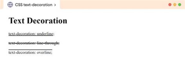
CSS 3 will likely have direct support using the text-decoration-color property. In particular:
The
text-decoration-colorCSS property sets the color used when drawing underlines, overlines, or strike-throughs specified bytext-decoration-line. This is the preferred way to color these text decorations, rather than using combinations of other HTML elements.
Also see text-decoration-color in the CSS 3 draft spec.
If you want to use this method immediately, you probably have to prefix it, using -moz-text-decoration-color. (Also specify it without -moz-, for forward-compatibility.)
I've used an empty :after element and decorated one border on it. You can even use CSS transforms to rotate it for a slanted line. Result: pure CSS, no extra HTML elements! Downside: doesn't wrap across multiple lines, although IMO you shouldn't use strikethrough on large blocks of text anyway.
s, strike { text-decoration: none; /*we're replacing the default line-through*/ position: relative; display: inline-block; /* keeps it from wrapping across multiple lines */ } s:after, strike:after { content: ""; /* required property */ position: absolute; bottom: 0; left: 0; border-top: 2px solid red; height: 45%; /* adjust as necessary, depending on line thickness */ /* or use calc() if you don't need to support IE8: */ height: calc(50% - 1px); /* 1px = half the line thickness */ width: 100%; transform: rotateZ(-4deg); }<p>Here comes some <strike>strike-through</strike> text!</p>This CSS3 will make you line through property more easier, and working fine.
span{ text-decoration: line-through; text-decoration-color: red; } If you do not care about internet explorer\edge, then simplest way to achieve different color for strike-through would be to use CSS property: text-decoration-color in conjunction with text-decoration:line-through;
.yourClass { text-decoration: line-through !important; text-decoration-color: red !important; } -- Does not work with Edge\Internet Explorer
Adding to @gojomo you could use :after pseudo element for the additional element. The only caveat is that you'll need to define your innerText in a data-text attribute since CSS has limited content functions.
s { color: red; text-align: -1000em; overflow: hidden; } s:after { color: black; content: attr(data-text); }<s>Strikethrough</s>Here's an approach which uses a gradient to fake the line. It works with multiline strikes and doesn't need additional DOM elements. But as it's a background gradient, it's behind the text...
del, strike { text-decoration: none; line-height: 1.4; background-image: -webkit-gradient(linear, left top, left bottom, from(transparent), color-stop(0.63em, transparent), color-stop(0.63em, #ff0000), color-stop(0.7em, #ff0000), color-stop(0.7em, transparent), to(transparent)); background-image: -webkit-linear-gradient(top, transparent 0em, transparent 0.63em, #ff0000 0.63em, #ff0000 0.7em, transparent 0.7em, transparent 1.4em); background-image: -o-linear-gradient(top, transparent 0em, transparent 0.63em, #ff0000 0.63em, #ff0000 0.7em, transparent 0.7em, transparent 1.4em); background-image: linear-gradient(to bottom, transparent 0em, transparent 0.63em, #ff0000 0.63em, #ff0000 0.7em, transparent 0.7em, transparent 1.4em); -webkit-background-size: 1.4em 1.4em; background-size: 1.4em 1.4em; background-repeat: repeat; } Gradient color-stops and background size depend on line-height. (I used LESS for calculation and Autoprefixer afterwards...)
Here you go:
<style>body {color: #000;}</style> <del> <span>facebook</span> </del>In my experience the
<span style='color:red;text-decoration:line-through'> <span style='color:black'>black with red strikethrough</span> </span> isn't the best option. I had a co worker use this method without testing cross browser, so I had to go back and fix it because it caused issues in firefox. My personal recommendation would be to use the :after selector to create a strikethrough. That way it can go back to IE8 if you really wanted to without any style conflicts as well as solid across all other browsers.
It also creates less markup and about the same amount of styling which in my opinion is a pretty big deal.
So if anyone else runs into similar issues hopefully this can help out:
.lineThrough { position: relative; &:after { content: " "; display: block; width: 60px; height: 1px; background: red; position: absolute; top: 49%; left: 50%; margin-left: -30px; } } obviously you could use transform: translate instead of margins, but this example is to work back to IE8
Blazemonger's reply (above or below) needs voting up - but I don't have enough points.
I wanted to add a grey bar across some 20px wide CSS round buttons to indicate "not available" and tweaked Blazemonger's css:
.round_btn:after { content:""; /* required property */ position: absolute; top: 6px; left: -1px; border-top: 6px solid rgba(170,170,170,0.65); height: 6px; width: 19px; } If it helps someone you can just use css property
text-decoration-color: red;
Single Property solution is:
.className { text-decoration: line-through red; }; Define your color after line through property.
Assigning the desired line-through color to a parent element works for the deleted text element (<del>) as well - making the assumption the client renders <del> as a line-through.
Just an update, this can be easily done now by doing:
text-decoration: underline; text-decoration: underline dotted; text-decoration: underline dotted red; text-decoration: green wavy underline; text-decoration: underline overline #FF3028; then add the desired font color with color: ....
Adding something that wasn't obvious to me when you apply this to React inline styling:
<p style= {{textDecoration:'line-through red', color:'gray'}} > you need to switch the '-' for cammel case.
This renders the content of
....
in color gray crossed out by a red line.
For more details check the documentation here
Here is a sample jQuery implementation – thanks to gojomo's answer and utype's suggestion (+1 for both)
$(function(){ //=================================================================== // Special price strike-out text // Usage: // Normally: <span class='price'>$59</span> // On special: <span class='price' special='$29'>$59</span> //=================================================================== $(".price[special]").each(function() { var originalPrice = $(this).text(); $(this).html('<strike><span>' + originalPrice +'</span></strike> ' + $(this).attr('special')) .removeAttr('special') .addClass('special'); }); }); The CSS for that could be
.price strike, .price.special { color: Red; } .price strike span { color: Black; }