Trying to add an horizontal line with a given value to a line chart with the following code:
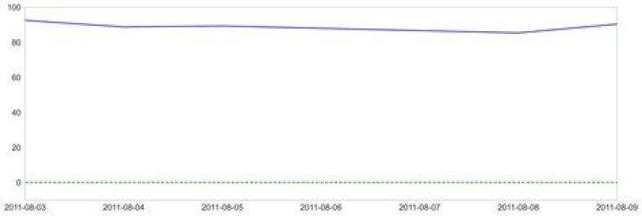
x = data.index y = data['AMZN US EQUITY_PE_RATIO'] plt.figure(figsize = (18,6)) plt.axhline(y = 0, color ="green", linestyle ="--") plt.plot(x, y, linestyle = '-', color = 'b') However the axhline always plots on a separate chart. I would like the line to be plotted on the same graph as the line chart. Anybody knows what I'm doing wrong?
Sample data:
data = pd.DataFrame({'TSLA US Equity_PE_RATIO': {Timestamp('2011-08-03 00:00:00'): nan, Timestamp('2011-08-04 00:00:00'): nan, Timestamp('2011-08-05 00:00:00'): nan, Timestamp('2011-08-08 00:00:00'): nan, Timestamp('2011-08-09 00:00:00'): nan}, 'AMZN US EQUITY_PE_RATIO': {Timestamp('2011-08-03 00:00:00'): 92.4934, Timestamp('2011-08-04 00:00:00'): 88.7577, Timestamp('2011-08-05 00:00:00'): 89.2952, Timestamp('2011-08-08 00:00:00'): 85.3304, Timestamp('2011-08-09 00:00:00'): 90.348}}) 1 Answer
I managed to reproduce the issue given your sample data and got it to work by swapping the order of axhline() and plot():
plt.figure(figsize=(18, 6)) plt.plot(x, y, linestyle='-', color='b') plt.axhline(y=0, linestyle='--', color='g') Normally there's no issue with plotting axhline() first, but here I guess the issue is that data.index contains Timestamp objects. When axhline gets plotted first (on a normal x-axis), there seems to be some issue in mixing it with subsequent date data. The simplest workaround is just to call plot() first.