I have below a working example of a plotly dash app which displays a dropdown on a tab, and then displays an alert as a result of selecting an item in the dropdown.
#!/usr/bin/env python3 import dash import dash_bootstrap_components as dbc import dash_core_components as dcc import dash_html_components as html from dash.dependencies import Input, Output app = dash.Dash('Example', external_stylesheets=[dbc.themes.DARKLY]) app.title = 'Example' app.layout = dbc.Tabs([ dbc.Tab( dbc.Card([ dcc.Dropdown(id='dropdown', options=[ { 'label': 'Item 1', 'value': 'foo' }, { 'label': 'Item 2', 'value': 'bar' }, ], ), html.Br(), html.Div(id='item-display'), ], body=True), label='Tab 1') ]) @app.callback( Output('item-display', 'children'), [Input('dropdown', 'value')] ) def display_item(v): return dbc.Alert(f'You selected Item {value}', color='primary') if v else '' if __name__ == '__main__': app.run_server(debug=True) I'm using the bootswatch darkly theme.
The problem I'm having is I don't know how to style the dash_core_components.Dropdown with the bootstrap style.
As can be seen in the below images, the dash_bootstrap_components elements are all styled according to the bootstrap style, but the Dropdown is not, and in fact the text when dropped down is almost impossible to read as it is white text on a very light background.
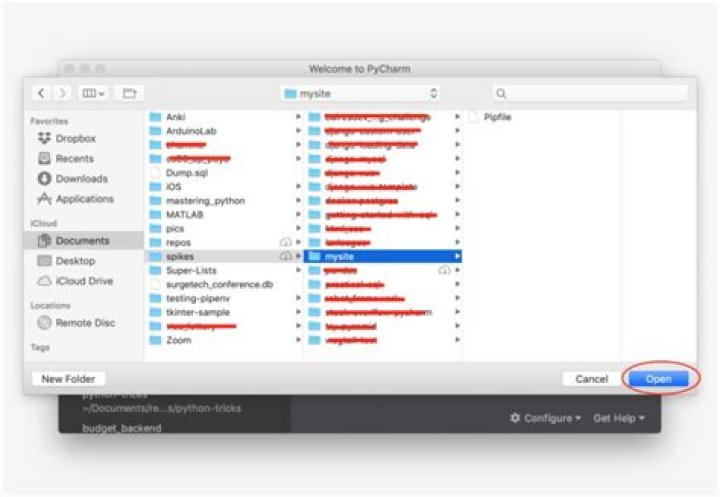
In the darkly samples, the dropdown looks like this:
When hovering over an option, the background is the bootstrap "primary" color:
How can I style the dcc.Dropdown according to the bootstrap style?
1 Answer
I noticed that you put the question on the Plotly forums as well and that in particular, the answer linked in one of the answers probably contains a useful starting point. What I did myself was a slight modification of this answer: Add a assets/dropdown.css with the following contents:
.Select-control { background-color: #222 !important; } .Select.is-focused > .Select-control { background-color: #222; } #school-input { color: white; } .Select-value-label { color: white; } .Select--single > .Select-control .Select-value, .Select-placeholder { border: 1px solid grey; border-radius: 4px; } .VirtualizedSelectOption { background-color: #222; color: white; } .VirtualizedSelectFocusedOption { background-color: #222; opacity: .7; } .Select.is-focused:not(.is-open) > .Select-control { background-color: #222; border-color: var(--primary); box-shadow: none; } The result looks as follows: